CodeJam
Role
UI/UX Designer
Duration
Aug 2021 - Dec 2021
Tools
Figma
Team
Team Project
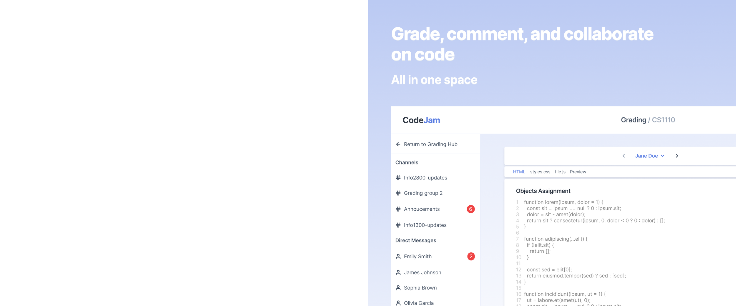
Helping graders grade, comment, and collaborate on code, all in one space.
From directly commenting on code to face-timing other teacher assistants, CodeJam makes complex grading simple and easy to do.
CodeJam is a design project that offers teaching assistants (TAs) with a new innovative and efficient way of grading and collaborating on student code submissions.
Context
User research
Design concept
Heuristic Evaluation & User Testing
The Problem
Being a TA and grading hundreds of student submissions isn’t easy — it takes hours and hours, and often TA’s don’t have the right tools or knowledge to grade efficiently and fairly.
In particular, being a computer science TA requires downloading additional programs and files, and opening copious numbers of tabs and windows that clutter the desktop screen making the grading process frustrating.
Timeline
This project took 10 weeks to complete. The design process was divided into four phases:
Phase 1: User Research (3 weeks) — Interview plan, data analysis, personas
Phase 2: Designing (3 weeks) — Design ideation, sketching, storyboarding, UI design & sketching, mental models, metaphors, affordances, design analysis
Phase 3: Prototyping (2 weeks) — Paper prototyping, Figma prototyping
Phase 4: Evaluating (2 weeks) — Heuristic evaluation, usability testing
Finding solutions through our target user group
10 computer science teacher assistant’s at Cornell University were interviewed to better understand the current undergraduate teaching experience. 4 goals were kept in mind during each of these interviews:
Identify user goals and motivations
Understand user activity/behavior patterns
Recognize and classify current problems as well as high points
Determine current products used to share content
Our findings
After 3 weeks of conducting in-person interviews, the team was able to reach the following insights:
TAs were often responsible for managing many teaching materials on multiple tools and platforms, which was overwhelming for them to handle many things at once.
TAs had a difficult time utilizing the existing products and platforms for their teaching needs.
TAs valued optimizing their time when in engaging in TA related activities (office hours, grading, etc.)
Alignment of faculty expectations is important for TA performance.
After carefully identifying and analyzing five existing solutions to our problem space, the team and I arrived at several design tasks that addressed our users’ needs.
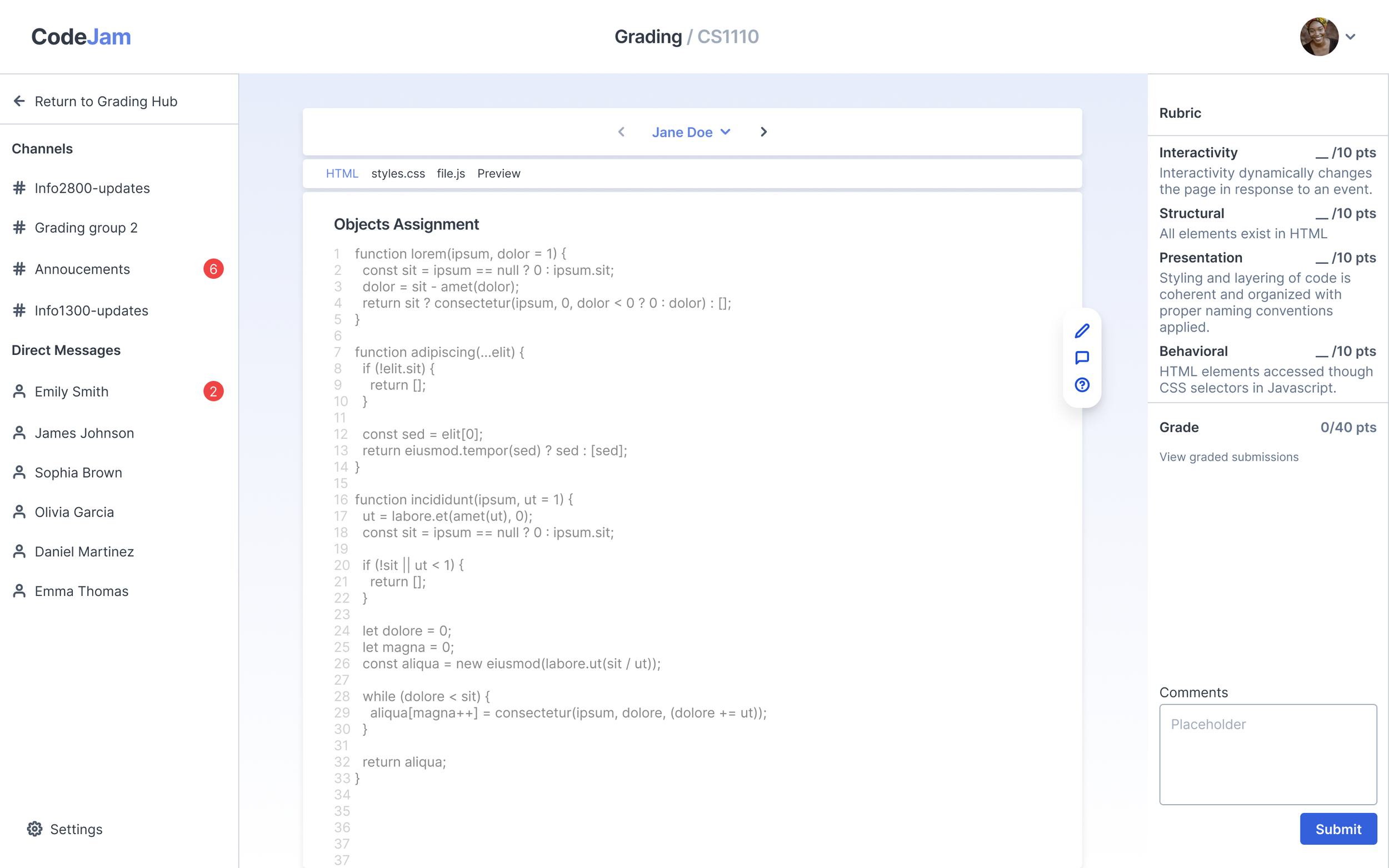
Users need to be able to publish grades and comment directly on their students’ codes.
Users need the ability to communicate with other TAs through messaging or facetime in order to collaboratively work on grading code.
Users needed the ability to view their peers graded submissions for cross-checking and referencing.
4 computer science TAs were recruited to complete the previous tasks in order to assess whether our designs complied with usability principles.
Analyzing our findings
All users were able to complete the given tasks, however, our metrics demonstrated that users had trouble overcoming the learning curve for our app. This is demonstrated by the lower completion rates (Learnability Metric) associated with our usability testing sessions. Many of the users’ errors were cosmetic and minor, which meant design improvements would be feasible for the team.
Design Improvements
3 design improvements were made to alleviate the pain-points discovered from user testing:
Redesign of feature entry points: Icons for Request Help and Reference weren’t intuitive enough.
Remove “Auto-calculate” button: Users didn’t understand functionality of Auto-calculate button.
Implementation of a Progress bar: Users were confused whether they had completed grading a specific assignment or not.
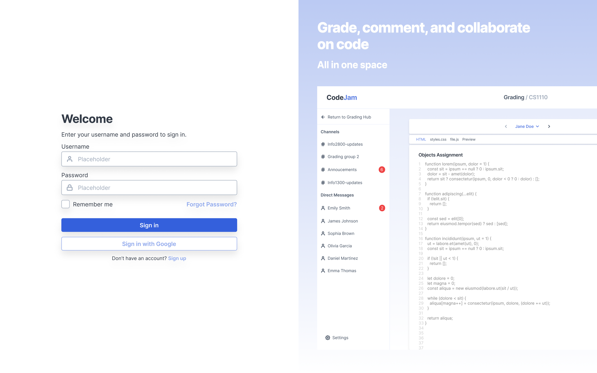
Log In
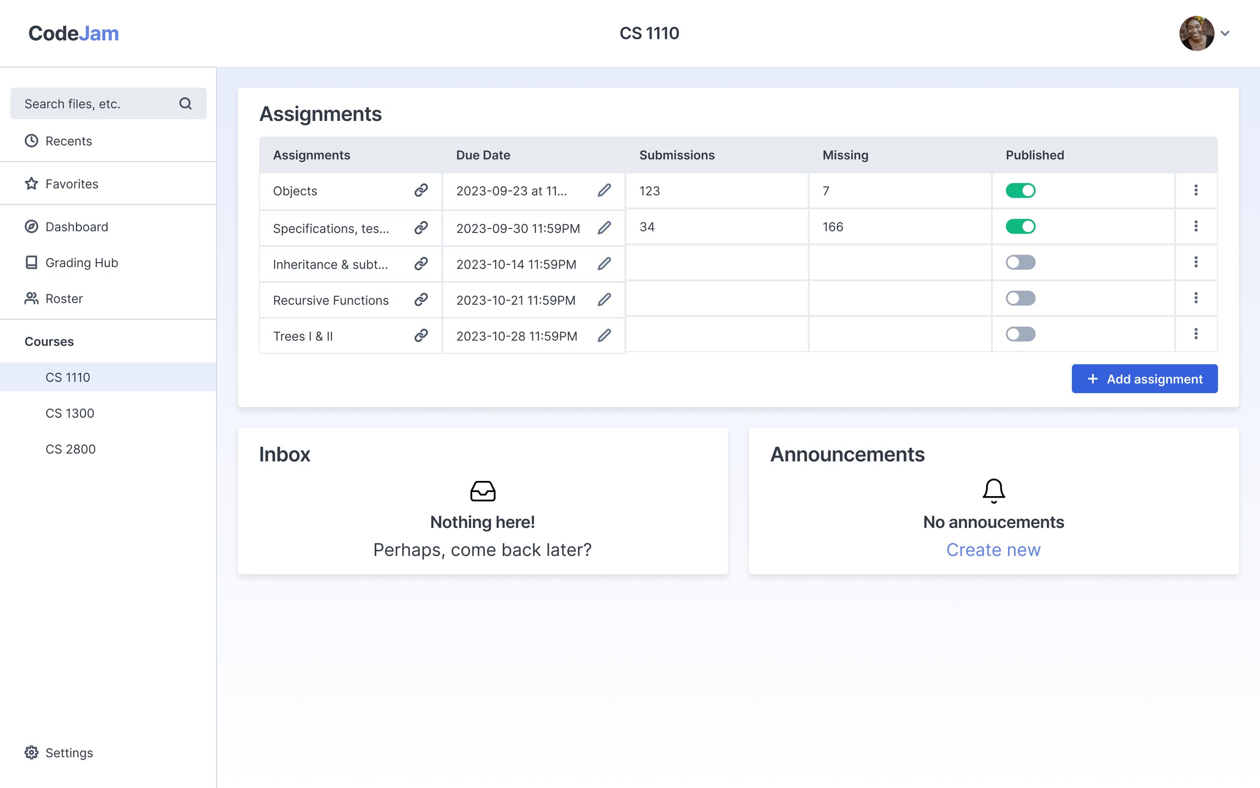
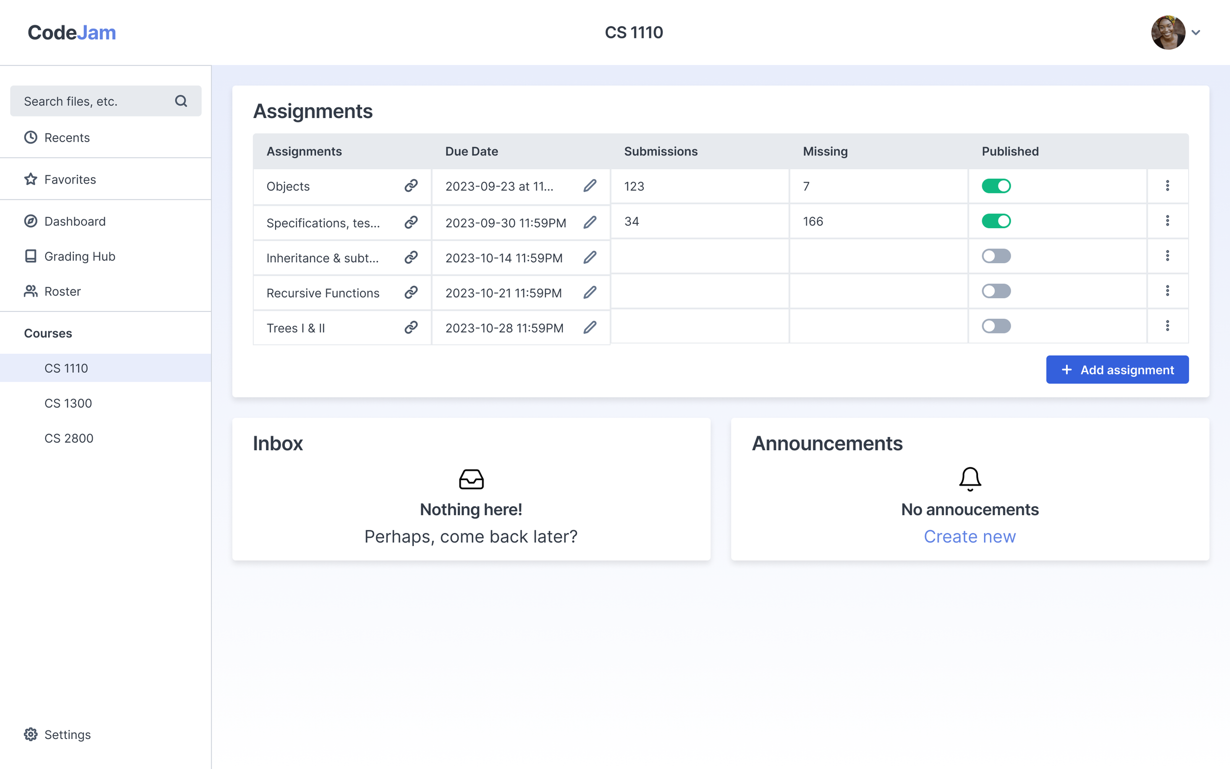
Course Dashboard
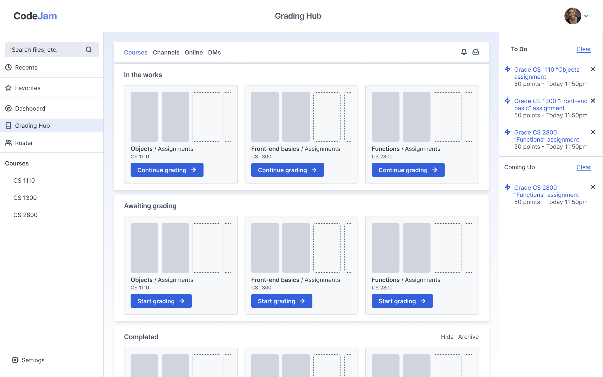
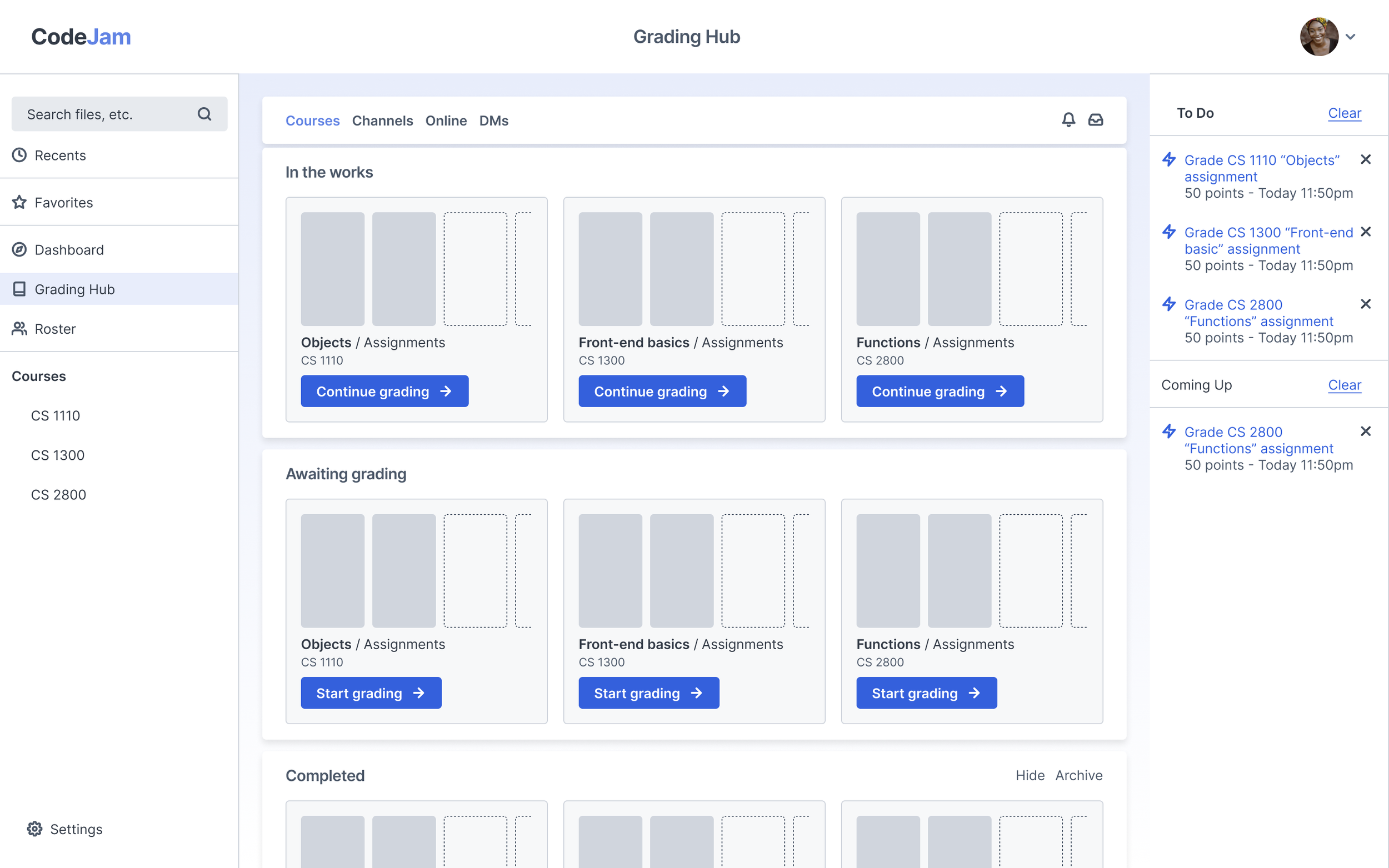
Grading Hub
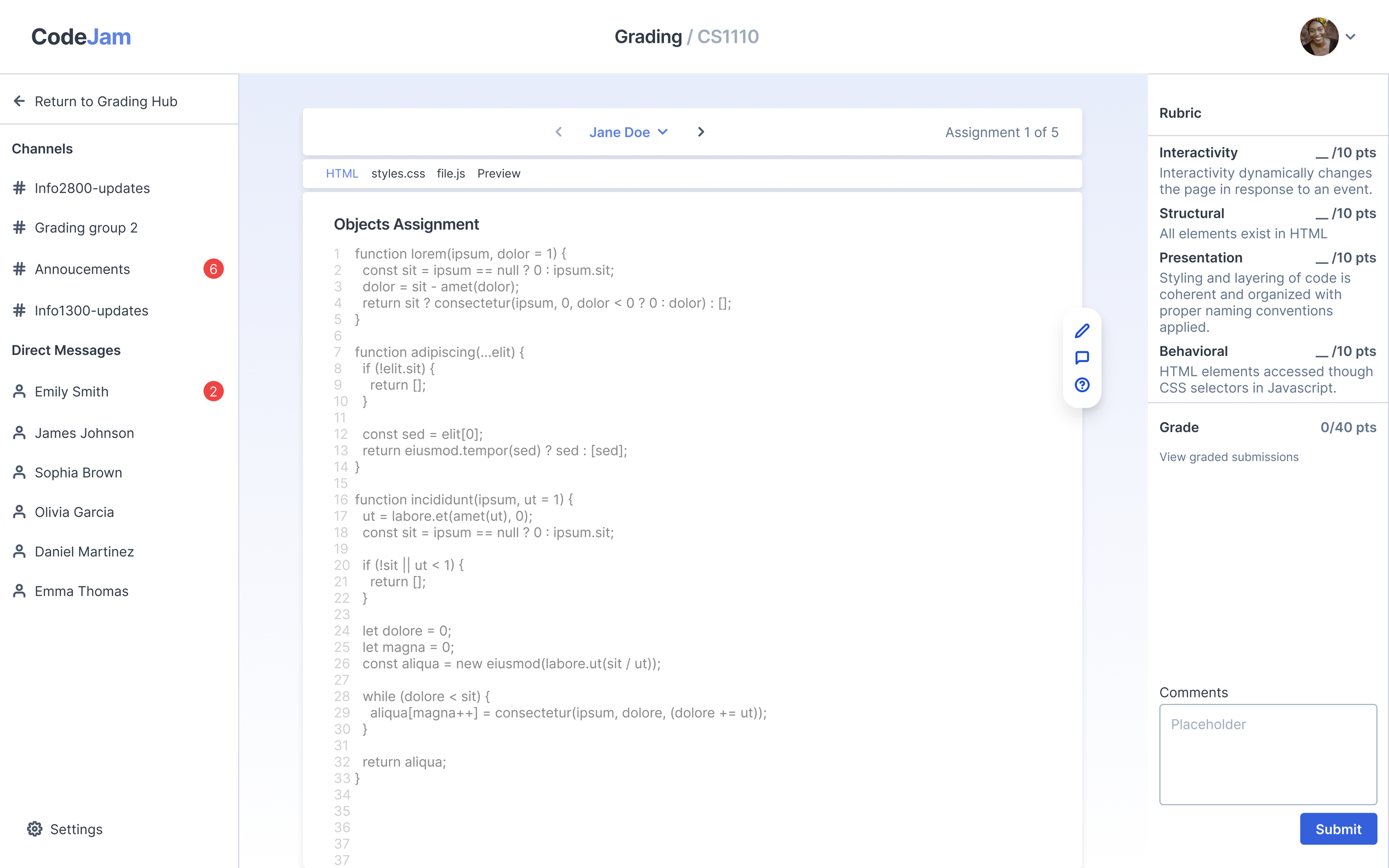
Grading and collaboration space
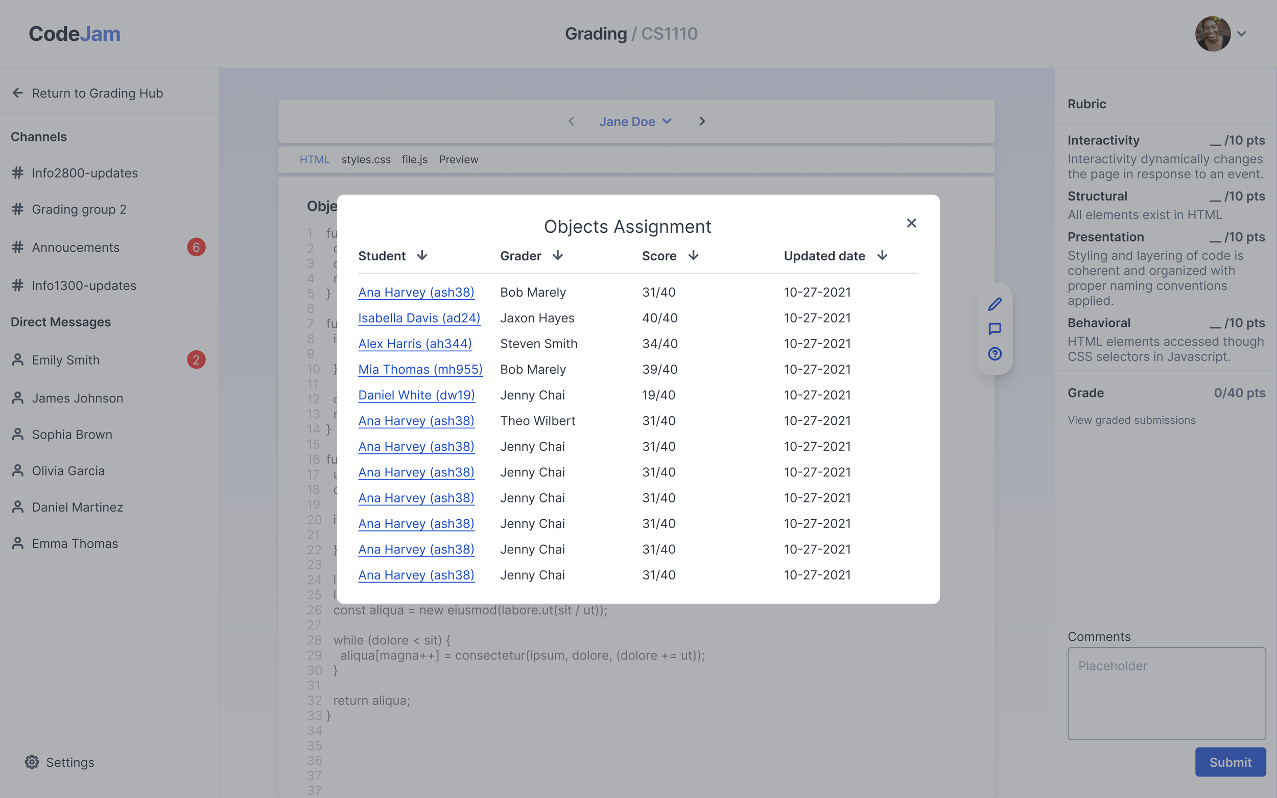
Viewing peers' graded submissions
Takeaways
Collaboration is difficult, only if you don’t communicate
The way this project was designed in terms of collaborative work was both challenging and compelling. Because designs, analysis, and ideations were first done individually, there were sometimes difficulty maintaining coherence and design consistencies. However, team members were vocal and proactive in discussing their ideas which lead to amazing designs and ideas. It was a pleasure working on this project and ultimately creating a product that is backed by research.
These wireframes have been designed and updated by me. To view the old designs click here.